Suggestion for better legibility of the text


#1

Hey VOX folks!

This app is awesome. Exactly what I was looking for! Thank you! It’s almost perfect.

Why almost?

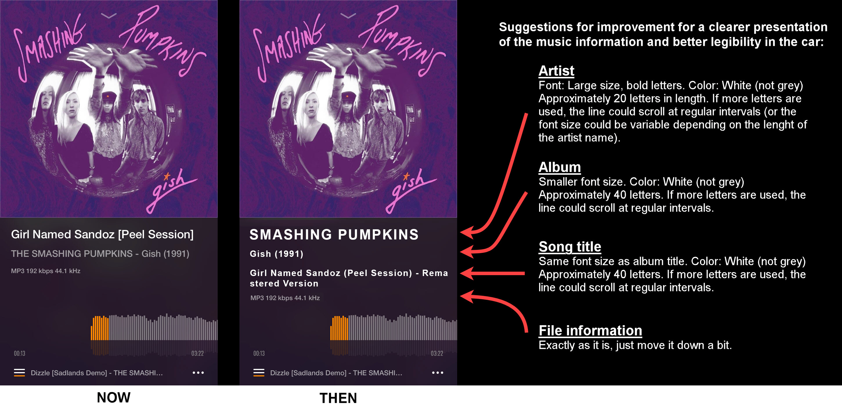
However there is one thing that could be better. The visualisation of the text information could be a bit clearer.
I really like using the app in the car while driving and I like the big album cover. But the music information (artist, album, song title) is not easy to read, especially when looking at the display from a distance.

See my suggestion in the attachment how to improve it a bit. (P.S: For the song title two lines should be available, as is the case already).

#StandWithUkraine
IMG_B174D72D9204-1


#2

YES! Actually I don’t have much problem with the text that OP mentions… my main problem is the numbers for elapsed and remaining time. Sometimes I like to see those numbers. I am in my 50s and cannot read small text without glasses, and I am often using Vox while not wearing them (bec I don’t need them except for reading). Those numbers are SO damn small, I can barely see them even WITH glasses! Please make those numbers bigger. They don’t compete with anything else in the UI… there’s plenty of blank space around them. Please make them several point sizes bigger, so those of us without perfect vision can see them easily. Thx.