First of all I should express my gratitude for the app. I otherwise appreciate and am very happy with it. In my own looking around, I have seen the concern over lack of a fullscreen option and have seen the reasoning for it. Pardon my wording but this is terrible logic. Putting appearance over functionality. Keeping it "minimalistic". This seems to be the way so much tech is going. What is is, is an accessibility issue. Some of us old fogies have a difficult time navigating in such a cramped space.I find it very difficult and /or frustrating hunting around for controls and files. Please PLEASE at least make full screen an option. I need the whole dance floor not just a couple of tiles.
PLEASE have a full screen option
Hi!
We didn't release it because we want to keep the minimalistic design.
But thanks, we'll consider it.
Anonymous
#3
Yes I know that is your reasoning and I said I knew in my post. I also said why that is poor reasoning. This sounds like a canned or automated response. My points were ignored.Is it because supporting full screen is difficult? If people want minimalistic, It would be very easy to set it that way. A design with options is better than an imposed one.
Well, your points are not ignored. The thing is - that we have our vision of our product and how it's going to be developed in future.
We appreciate your opinion and it will definitely reflect on our plans for development.
Thank you!
Anonymous
#5
I don't know what the 'full screen' version was, but having (on mac desktop) the inability to see long file names is insane. Load the Bob Dylan Bootleg Series 12 Collectors Edition, with 10+ versions of songs with long names and you can NEVER see the names of the files. That's not 'vision' that's failure to account for common use cases. There is no reason to block expanding the window to a wider size other than hubris and bad planning.
Minimalistic is a ridiculous word - it's a distraction and an excuse. right now you're minimal (meaning incomplete). You need the features that accomplish the core functions users require - and then yes you can skip extravagances. Using 'minimalistic' as an excuse is like saying 'we only wanted to have 7 features'. Designing in concise and elegant ways - that's minimalistic. You have a soundcloud icon as default that can't be hidden when a massive number of users obviously don't use soundcloud. That's extravagant and wasteful. Radio stations? Bloated. Enforcing a pixel width limit at the expense of allowing long file names to display? Punishing to your users.
Think again.
Anonymous
#6
Some more proof that your current limited window width is inadequate for the real world in which your customers live...

Anonymous
#7
Yes - the window is too small. I was just about to sign up and then started putting it through it's paces. I have a lot of my own music with long titles and take numbers. Without the ability to open the window large enough to see the entire title, let alone other info, it's kind of a useless interface. Get us a useable list window - even if it's an option. Just silly to have an interface where you can't see what you are playing...
Thanks,
Bob
Absolutely agree. Before using “minimalistic” too often, please consider what it means in terms of bauhaus, industrial design and ui today. Having a artwork-oriented interface with minimal amount of information instead of the current winamp-like interface is more minimalistic than having type of file, downloaded status and list view. This is extremely true on desktop. You need not look further than iTunes design. All the info is there, but is invisible and minimalistic. Only you and the music are left. And artwork is a part of the music experience ever since 7" vinyl.
Consider this to be a major deal-breaker for lots of customers. If i wanted a clunky music app able to play flac, i could easily use VLC or foobar. Instead i want “an iTunes that we deserve”. Take the best of two worlds, i know at least 4 other people who would pay for such an experience, and were pushed away by your current poor list design, which is in fact very easy to fix. 
adam1
#9
Wow. I just downloaded this dumb app, and deleted it within 5 minutes when I saw that you can’t expand the width of the app on a DESKTOP interface. I can’t read any of the titles of the tracks.
Absolutely stupid design.
Saw that this thread was started 4 years ago, so consider how many people deleted this garbage who did NOT bother to take the time to come in here and tell these UX designers how stupid they are.
I agree, and as a software engineer myself I think it is ridiculous not to provide a fullscreen option if users want one. I don’t want my music or audiobook to be out of the way hidden under other windows; I want it to be immersive. I just downloaded this app and came here to say this. Now I am deleting it.
Also, the notification guides on this forum prompting about “your first notification, gee, see what you can do with it” is not clever and certainly not helpful, but intrusive. I had to click away from it three times and it kept coming back. You guys can keep your user model, because I don’t think your users want it.
cyan
#11
The screens you offer are just not sufficient to use this program.
Unless I’ve missed the button all I can see is very basic info - no ability to manipulate play lists etc.
Is short, no useful interface.
Sorry, I’m trying something else.
VOX_Support_Team
#12
Thanks for your post!
To begin with, VOX has an option to create and store playlists, import playlists from .mu3, pls files, and sync playlists from iTunes, SoundCloud, etc.
Please share some details about the use case, and we will be glad to pinpoint how it could be done using VOX.
travel
#13
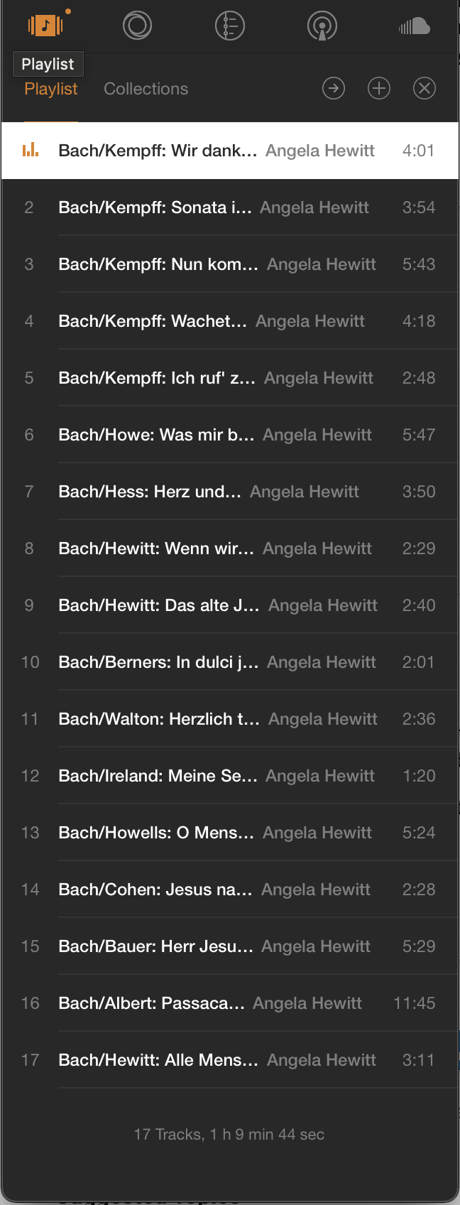
Usecase: I would like to be able to read the titles of the tracks of the music I’m listening to without having to hover over each one:
cspaight20
#14
This is annoying. There is so much to like about this app but the fact that I can’t see the entire title might be a dealbreaker. The fact that this thread has been going for years and you don’t care says a lot about your company. Do better.
VOX_Support_Team
#15
Thanks for your post!
We’ve released a beta version of the VOX Universal.app, supported on Windows and macOS, which has a full-screen view.
You can learn more here: https://vox.rocks/forum/t/vox-universal-beta-v07-12-release-notes-download-links-etc/12980/8