Interface design


#1

Vox seems like a great solution for streaming audio between devices with unlimited storage. I would like to subscribe to the premium account upgrade, however the lack of options to organize my content and view my album covers is a major barrier to signing up. Reading the various threads on this forum, it seems I’m not alone in this matter.

Given that Vox’s strapline is “it’s all about the music”; It beggars belief that VOX’s interface discriminates album artwork from the browsing process. Historically, album covers are as sought after as the music itself and aids in navigating through music collections.

Perhaps VOX might consider a separate tab for hi-res music which automatically filters hi-res files from all of the low-res lossy mp3 music. This is a really helpful feature included in ‘ONKYO’ audio smart phone app.

It might also be useful to be able to edit meta tags etc.

To conclude, in my opinion VOX has huge potential to be a world class Hi-res music app, however the current version is too draconian. It’s minimalist approach would be better served as an alternative mini player option as enjoyed by most other music apps. Unfortunately I feel the current over simplified interface discriminates those who appreciate both art and music. Scrolling through soulless directories is not very inspiring.

#2

Thanks for reaching out!

We really appreciate your efforts to provide us with feedback, as we try to improve our app for our customers on a daily basis.

Given that Vox’s strapline is “it’s all about the music”; It beggars belief that VOX’s interface discriminates album artwork from the browsing process. Historically, album covers are as sought after as the music itself and aids in navigating through music collections.

However, we are not absolutely sure what exactly do you mean. Is it possible to use an example (how would it work for you?) to explain the task to the dev.team.

As for the feature set, I would appreciate some additional details, so I could collect your feature requests and pass them to the dev.team.

Looking forward to your reply, thanks in advance!


#3

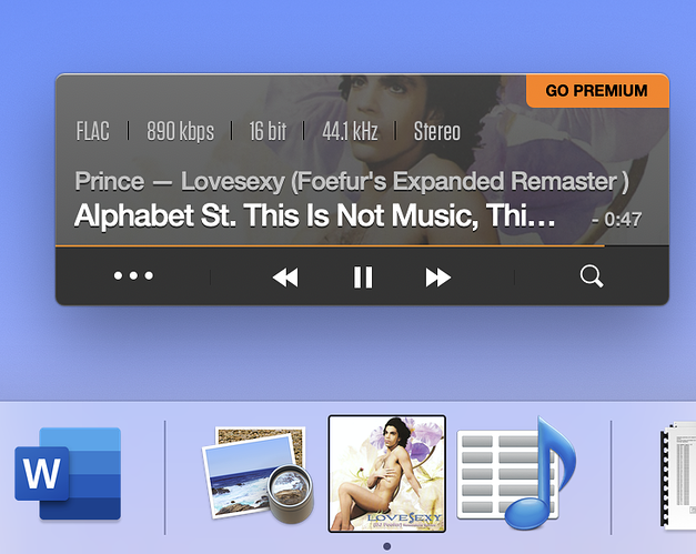
I agree with Jonathan. Enjoying the album art while listening to the music is an important part of the overall experience for us music lovers, and Vox sorely lacks in that department. I’ve attached a view of my listening experience today (Prince, ’ Lovesexy’). So small and minimalist! My suggestion is for users to have the ability for full album art to display in the main interface instead of having just a small section of it visible at any time. I also would subscribe to Premium if the UI was better and the album art was visible.