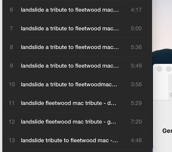
I love Vox music player. It’s so much better than iTunes. Is there anyway for users to make the interface wider? Many of the songs in my library are titled, ‘artist; album; song’ which makes it frustrating that I can’t see what song I want because the width of the display is only wide enough to display, 'artist; alb…" (so an album of 20 songs look identical in the list, since the first 35 characters are the same).
Appearance prefs question
tch
#1
isaijaimes
#2
Yes please, as a dj widening the interface would be the only thing that VOX could fix for it to be perfect!
Thanks for your posts!
As you may already know, we are working on a fullscreen, cross-platform version of the VOX app.
All your comments will be taken into consideration. Stay tuned!

